This is a case study about Designing a system that puts regulatory knowledge at your fingertips.
Regology · 2019–2020Product Design + Research
Project at a glance
Role
Lead UX Designer
Platform
Web Application
Scope
Research → System Design → Handoff
02 · Context
Regology was a regtech platform that used AI to help financial institutions track and comply with thousands of regulations across multiple jurisdictions simultaneously. I joined as the sole product designer and owned the UX end-to-end, from user research and wireframes through to a full design system and developer handoff.
What I designed→Where it is now
Dashboard & Explorations→Regulatory Research Agent
Alerts & Filters→Regulatory Change Agent
Regulation Hierarchy→Change tracking AI
Read Mode & Assignment→Compliance Agent
Configuration→Agent workflow engine
Interactive infographic
The Core Model
Regology funnels the entire universe of laws down to the rules that apply to a single business, then drives an ongoing compliance cycle. Hover any node to explore it.
03 · Problem
The problem space.
Professional compliance users had sophisticated needs the product wasn’t yet meeting.
No jurisdiction-scoped search
Users couldn’t search within a specific jurisdiction; every query returned global results.
H·01 Visibility
Alert noise with no filter
78 unread alerts with no way to route, prioritise, or mute irrelevant feeds.
H·04 Consistency
Invisible regulation hierarchy
The parent–child relationship between CFR → Part → Section had no visual representation.
H·06 Recognition
Version changes without context
When regulations updated, there was no diff view to show what actually changed.
H·08 Aesthetic
04 · Process
From one sketch to a system.
Eighteen months, version after version, each release added the feature the last one revealed we needed. Click through the build.
Act I · Foundations
Act II · Workflow
Act III · Intelligence
Act IV · The System
v1.0
Act I · Foundations
A whiteboard idea.
It began as a single sketch, a way to see a regulation’s hierarchy at a glance. That one drawing became the north star for everything that followed.
Foundation · Hierarchy concept
01 / 10
v1→6.3
an eighteen-month journey
6
major feature areas shipped
1
design system holding it together
05 · Persona
Who we were designing for.
SR
Sarah Reynolds
Senior Compliance Officer
Global Financial Institution 5 years in role
Goals
Track multi-jurisdiction regs
Reduce manual checking
Stay ahead of changes
Pain Points
Information overload
No change alerts
No hierarchy view
Slow search
Tools Used
Manual spreadsheets
PDF regulators
Email threads
Mindset
Expert, time-pressured
Accuracy is non-negotiable
Wants navigation, not less data
“I spend half my day just trying to find out what changed, I should be spending it figuring out what to do about it.”
Monitors avg. 340 regulations
Works across 12+ jurisdictions
Primary device: desktop web app
Note: this persona has been updated to reflect Regology’s current 2026 user base, now spanning banking, crypto, energy, healthcare, and tech sectors.
06 · System
The design system.
Everything in the prototype runs on one typeface, one blue and a small, sturdy kit of components. This is that system, live and pokeable. Click the swatches, flip the switches, expand the rows.
Regology: UI KitInteractive
01 Typeface
Open Sans
The entire product is set in Open Sans, falling back to system-ui. A humanist sans chosen for long-form legal reading at small sizes, no second display face, no decoration.
Open Sans Regular400 · body & tables
Open Sans Semibold600 · titles & labels
Open Sans Bold700 · buttons & doc nos
Open Sans Italic400i · notes
02 Type scale
24pxPage title
15pxModal head
13.5pxSection title
13pxBody
12pxTable cell
11pxBadge
10.5pxCaption
Base size is 13px / 1.45. The scale stays deliberately tight, dense regulatory tables need predictable rhythm more than dramatic contrast.
03 Colour: click any swatch to copy
Brand
Primary Purple
#5B2A9E
Purple Dark
#43206F
Purple Soft
#EDE5FA
Semantic
Success
#1F9D57
Danger
#E0533D
Warning
#F0A02A
Neutrals
Ink
#2B2F36
Ink 2
#3D434D
Muted
#7B838F
Muted 2
#9AA2AE
Line
#E6E8EC
Surfaces
Page
#F6F7F9
White
#FFFFFF
Row Highlight
#FDF9E7
Chapter
#F8F2D6
04 Radius & spacing
5
6
8
9
11
6
10
14
18
26
30
Cards round at 9–11px, controls at 5–6px. Page gutters sit at 30px; card padding at 14–18px.
05 Buttons & controls: every interactive trigger, and where it belongs
Primary Action
The one true action on a screen, wearing the brand purple so the eye finds it instantly.
Include, Save, Apply Filter, the thing you most want clicked.Never more than one per view, and never for anything destructive.
Secondary Action
A soft-purple companion for the supporting action that sits beside the primary.
View details, open a panel, secondary confirm.Don’t pair two of these, one will always quietly lose.
Ghost Utility
Outlined and quiet, present when you look for it, invisible when you don’t.
Export, Cancel, low-stakes utilities.Not for the main action, it’s too shy to lead.
Danger Destructive
Stays calmly outlined, then floods red on hover, a beat of friction before regret.
Exclude, Delete, anything you can’t easily undo.Never the default focus, make people reach for it.
Icon button Utility
A 36×36 square for toolbar triggers where a word would crowd the row.
Filter, kebab menu, compact toolbars.Never without a tooltip, a lonely icon is a guess.
IncludeExclude
Action chips Action
Include / Exclude living inside a row or card, the lightweight cousins of the big buttons.
Per-item include & exclude in tables and reg cards.Not for page-level actions, promote those to buttons.
Segmented toggle View switch
Flips between equal ways of seeing the same data, with one always lit.
Table ↔ Card. Two or three peers, max.Not for filtering, that’s what tabs are for.
Filter tabs View switch
Scopes a list in place, same screen, narrower slice.
Include / Unread / Exclude states of a result set.Don’t mix with navigation, tabs stay on one page.
Switch Toggle
Instant on/off with no Save in sight, the change happens the moment it flips.
Decompose mode, Track changes, live preferences.Not when the choice needs an explicit confirm step.
unchecked
Checkbox Selection
Multi-select for tables, click the demo to cycle its three states.
Row selection, with an indeterminate ‘some selected’ header.Not for a single yes/no, reach for a switch instead.
06 Badges & status
Status: lifecycle state
ActivePendingArchived
A coloured dot + label for where a record sits in its lifecycle. Read-only, never clickable.
Record badges: linked-item counts
3 Docs2 Risks1 Control
Count how many docs, risks or controls hang off a record. Tinted to their semantic colour.
Diff counts: version comparison
11 Additions10 Deletions
07 Pills & breadcrumb
Filter pills: selectable
US FederalEUStateLocal
Multi-select jurisdiction filters, tap to add or drop. More forgiving than a dropdown.
Breadcrumb with root
CFR/RootWage & Hour/Civil Penalties/Collection
Shows depth in the regulation hierarchy; every crumb but the last navigates upward.
08 Data table: select rows
Doc No
Title
Type
29 CFR 1910.132
Personal Protective Equipment
Requirement
7 CFR 1786.151
Collection & Recovery of Penalty
Sanction
29 CFR 1904.7
Recording Criteria
Requirement
0 selected
09 Accordion
Wage & Hour Division4
§ 580.12Collection of penalties
§ 580.13Civil money penalty review
Occupational Safety2
§ 1910.132PPE general requirements
10 Cards: variants & behaviour
Regulation card
7 CFR 1786.151US Federal
Collection and Recovery of Penalty
IncludeExclude
Panel card
Regulations6 total
4
Implemented
2
Under Review
Stat / alert card
26 Overdue Tasks
Pending since 11 Aug 2019
Every card shares the same recipe: 1px line, 9–11px radius, a faint shadow and 14–18px padding. They differ only in what they hold, a record, a panel of stats, or a single alert.
On hover a card lifts 4px with a soft shadow, a cheap, legible “this is clickable.” On click it locks into a selected state: a blue ring and a corner tick. Clicking the body opens the regulation; the chips act without leaving the list. (The middle and right cards are pinned to show the hover and selected states, click any card to toggle its selection.)
11 Version diff highlighting
The civil money penalty for each violation shall not exceed $2,374 $2,515, adjusted annually for inflation. A person desiring review must file a written exception within 30 days of the notice of assessment.
Additions wash in #FDEEB0 amber; deletions grey out with a strike. The same two tokens drive every diff in the product.
12 Grid system
Dashboard: two work columns + sidebar1fr 1fr 300px
PanelPanelSidebar
Stat rowrepeat(4, 1fr)
StatStatStatStat
Card resultsrepeat(3, 1fr)
CardCardCard
07 · Screens
From sketch to screen.
Process: sketches and flows
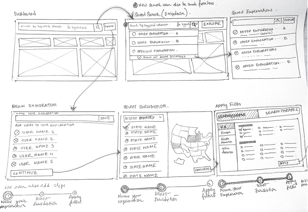
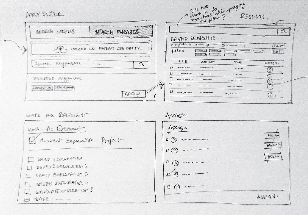
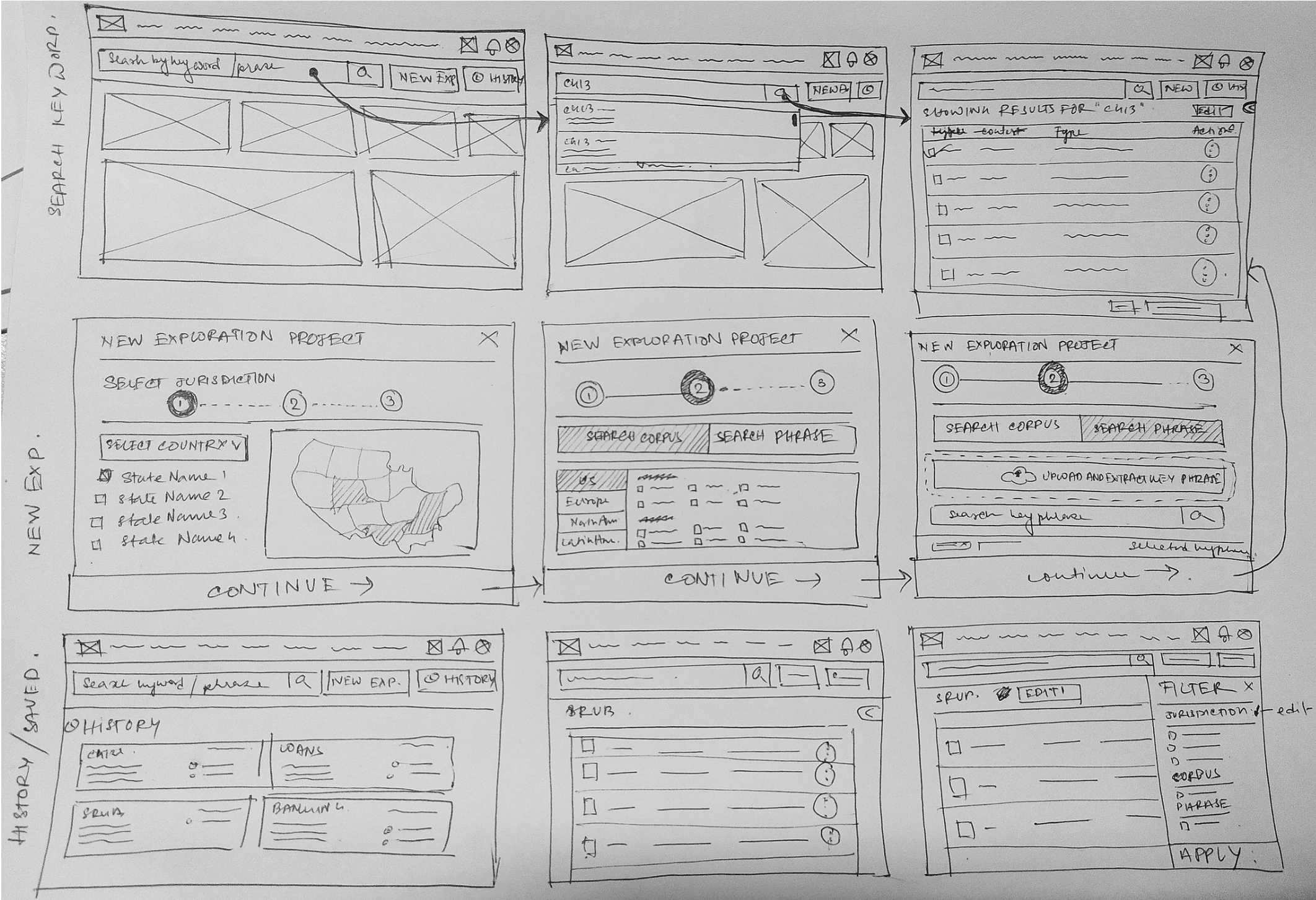
Early pencil wireframes that mapped the exploration journey before any pixels. Click any sketch to view it full size.